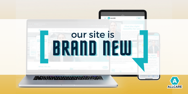
Anybody visiting a well-designed company website is greeted with a refreshing and memorable first impression. In addition to it being aesthetically pleasing, it communicates the objective to continuously improve to adapt to the needs of clients and members. We have already helped you obtain sufficient information regarding our services on a single, manageable platform through our revamped website, fam! With this in mind, below are the top 5 features of the ALLCARE website developed for a top-notch user experience. #1 No-nonsense Design With the simple structure and thoughtful use of symbols, you may see it as a clerk appropriately attired for an occasion (in this case, a business meeting with a client). This feature gets right to the point and makes a visual appeal! #2 How ALLCARE works page ALLCARE made a conscious effort to put a human face on the business. Consider this feature as an effective marketing tool for ALLCARE as an HR manager who prioritizes your well-being. You can learn more about what we do and the types of employee benefits you can expect on this recently updated page on our website. #3 Access to free content This feature seeks to provide insightful information and create distinctive tools to appeal not only to potential customers but also to SMEs, existing business owners, individual workers, and aspiring entrepreneurs. Since we sincerely believe that everyone has the right to access knowledge, we make every effort to bring people together as we sail. The written and audio-visual tools found in this section include ALLCARE Academy, Back to Square One, #AskCindy, and our blogs. #4 Organized product and services This section of the website is an embodiment of the statement that ALLCARE is a brand that cares about giving great customer experience from the moment they visit the website and screen the benefits they can avail until they actually enjoy them. For users' convenience, benefits packages are under the labels "for group" and "for individuals" on the website's upper section. This section's layout demonstrates how to balance using words and graphic organizers to make it easier for readers to understand the content. #5 Comprehensive FAQs The FAQ page has always been the customer's first port of call, and we are aware of its crucial significance in influencing potential customers' choices. Because of this, we wanted to make it as swift as a face-to-face transaction at a front desk. Confirming clients' or customers' comprehension of the content, it would be comparable to a non-real-time interaction. More than being the country's first and only digital benefits platform in Philippines; ALLCARE, at its very core, is a company that cares- and our greatest differentiator is the degree of empathy and care we put into everything we do. We attempt to make it visible and heard through every initiative.
Related Articles
Dec 11, 2020
Mar 15, 2021
Sep 16, 2019
Jan 12, 2023
Sep 01, 2022
